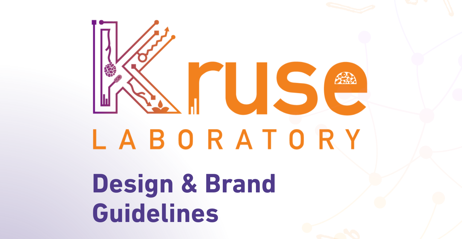
Kruse Laboratory
Infectious Disease Research · Spatial Biology · Scientific Visualization · Academic Branding
Brief
The Kruse Lab at The Ohio State University investigates the biochemical and spatial dynamics of infectious and metabolic diseases, particularly the persistence of Clostridioides difficile through biofilm formation in the intestine. The lab integrates cutting-edge spatial technologies, including mass spectrometry and advanced microscopy, to study the host–pathogen interface. With a multidisciplinary team led by their Principal Investigator, Dr Angela R.S. Kruse, and a mission rooted in translational impact, the lab required a scientific brand identity that could balance rigor with approachability and complexity with visual clarity.
My Roles:
Brand Designer, Visual Systems Architect, Logo Designer, Typography & Color Strategist, Scientific Illustrator
Tools I Used:
Illustrator, Photoshop, Figma, InDesign, WordPress, Google Workspace, Adobe Acrobat
Problem
Most academic research labs lack a cohesive visual identity, leading to fragmented communication and missed opportunities for public engagement, collaboration, and funding. The Kruse Lab sought to move beyond basic scientific templates, opting instead for a brand system that honored the precision of their spatial biology work while remaining adaptable across platforms such as grant submissions, scientific posters, publications, social media, and institutional collaborations.
The challenge was to build a brand identity that could hold its own in a competitive research landscape while reflecting the deeply technical, bioanalytical nature of the lab’s work.

Solution
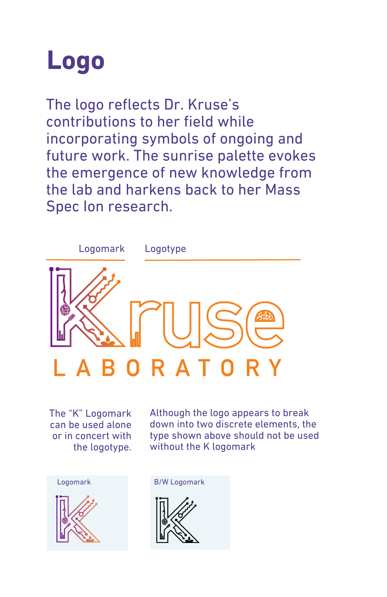
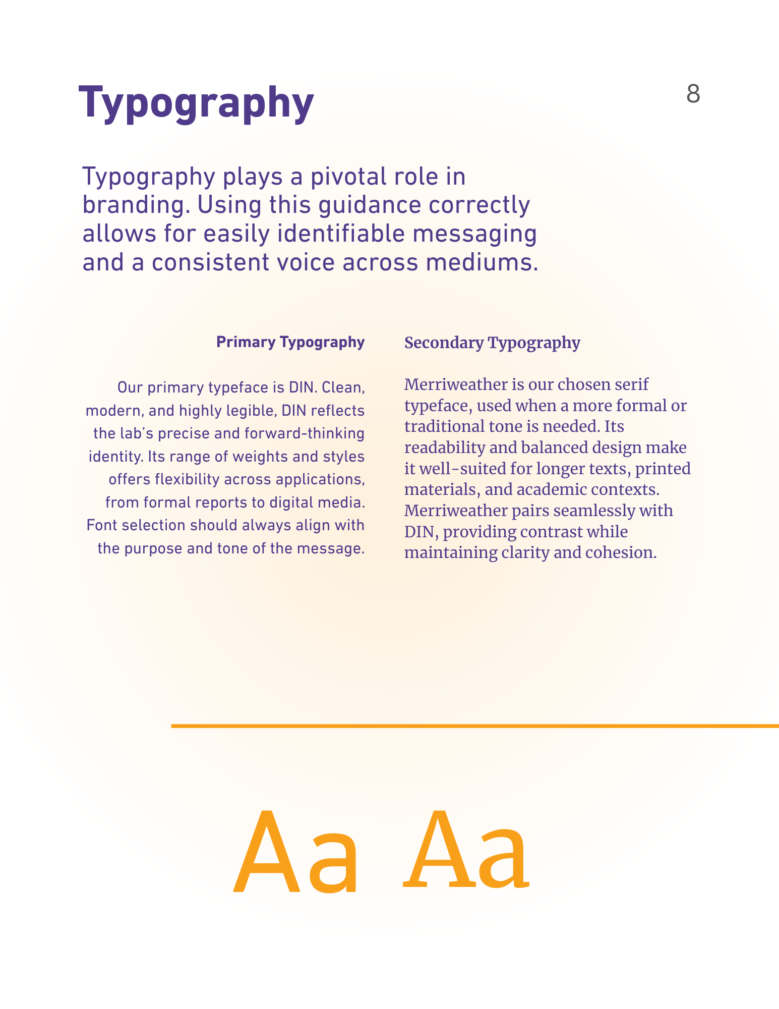
I designed the full logo system and brand architecture for the Kruse Lab. The centerpiece: a custom “K” logomark incorporating mass spec ion trails, biofilm formations, and molecular structures—evoking both the lab’s core research areas and its commitment to innovation. The supporting typography system features DIN (for scientific precision and clarity) and Merriweather (for academic gravitas and long-form readability), enabling flexibility across digital and print applications.
The visual palette was constructed around Currant (#303b8b)—a deep, confident violet—and a Mass Spectra gradient to nod to the lab’s imaging technologies. I authored a comprehensive brand guide (v1.02, August 2025) that included usage rules, logo variants, scalable templates, and cross-platform adaptations to ensure clarity and consistency in all scientific communications


My Contribution
This was more than just a logo; it was the design of a visual infrastructure for science. I created a brand that functions across grant decks and scientific posters, lab coats and PowerPoint slides, internal documents and public presentations. Every typographic decision, every color rule, and every variant was optimized for cross-disciplinary science communication in high-stakes, high-detail environments.
The result is a lab identity that is technically grounded, aesthetically coherent, and instantly recognizable- supporting Kruse Lab’s mission to make visible the invisible mechanisms of disease and healing.